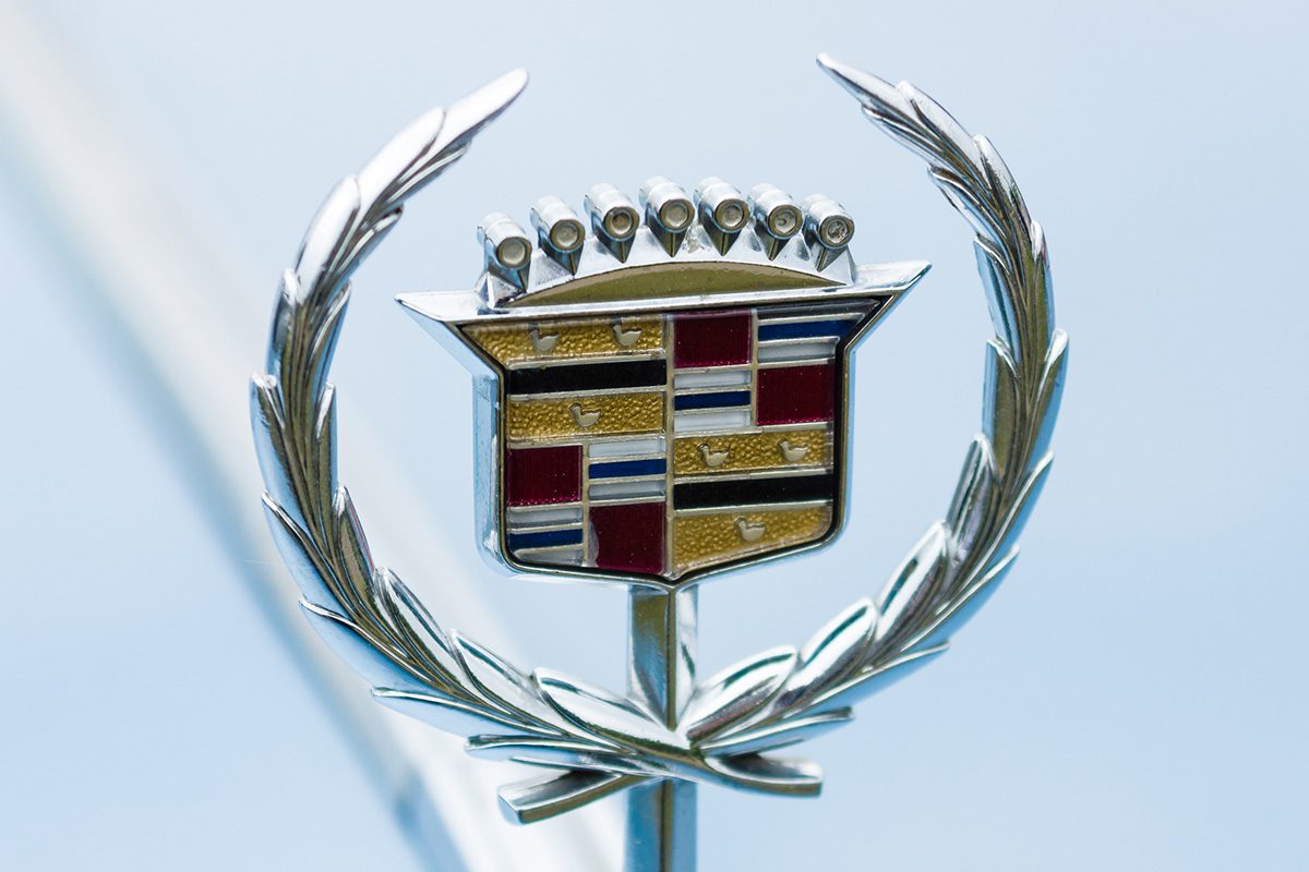
Found yourself wondering what happened to the ducks in the Cadillac logo? It's not a Mandela effect, the company really did change it.

Why the Ducks Were Removed from the Cadillac Logo

Logos are an integral part of brand recognition. They’re the visual shorthand that tells us at a glance who made the shirt, watch or car that we’re admiring. Because logos are so important for brands, changing them is a big deal. Some changes, like Kia’s logo change, leave consumers confused and wondering if there’s a new brand on the market. Others, like the plethora of iterations HBO Max has cycled through, seem nonsensical. But sometimes logo changes are far more subtle, like the absence of ducks on the Cadillac logo. Read on to find out when exactly the logo changed, what it was originally, and what it is now.
What Was the Old Logo?
Cadillac has gone through nearly 30 redesigns over the past 100 years, according to Sunset Cadillac of Sarasota. The original logo dates back to the early 1900s; the exact year is slightly debated, as the logo was in use for a couple of years before being officially registered.
Here’s what we know for sure. The logo was “based on the coat of arms belonging to Antoine de la Mothe Cadillac, who founded the city of Detroit in 1701,” Holiday Cadillac explains. It was comprised of “elements such as a crown, a trio of ducks (representing the Holy Trinity), horizontal stripes, and a laurel wreath.”
Over the years, the company has made many different adjustments to the logo, but retained certain key elements. Holiday Cadillac says that despite the many changes, the different iterations “all retained the coat of arms” except for “a short-lived variant in 1914.” The emphasis of the coat of arms changed quite a bit, however. It went through periods of being “at the top of a triangle, surrounded by a pair of wings, or encased in a circle of flowers.” But in all of these versions, “the coat of arms was always the centerpiece of the logo.”
When Did the Ducks Disappear From the Cadillac Logo?

The ducks, or merlettes as they’re sometimes described, survived many logo alterations over the years. But ultimately, the company cut them from the logo in the 1963 redesign, per Holiday Cadillac. In their place, the company added in black and gold stripes. That logo was the longest-lasting version, but it has been tweaked a few times since, most notably in 1999, when the company wanted it “modernized…for a more chiseled and sharp design,” and again in 2014. It’s stayed fairly consistent since then. So, if you’re someone who wants to be able to easily date a Cadillac, you don’t have to memorize any new versions just yet.
Source
History of the Cadillac Logo, Sunset Cadillac of Sarasota, 2019.
Cadillac Logo History and More, Holiday Cadillac.


